AI Tool

Julius AI
Julius AI
Julius AI
Upload a spreadsheet or connect your database, ask questions in plain English, get charts and statistics back — no code required.
Upload a spreadsheet or connect your database, ask questions in plain English, get charts and statistics back — no code required.
Julius started life in 2022 as a Y Combinator-backed experiment called ChatCSV — a dead-simple tool that let you upload a CSV and ask questions about it in plain English. Founder Rahul Sonwalkar had been building a logistics startup during YC but pivoted when he realized the question “can I just talk to my spreadsheet?” had no good answer. ChatCSV was his proof of concept. It went viral in data nerd Twitter circles almost immediately.
The insight buried in that early adoption was significant: the people who loved ChatCSV weren’t data engineers who wanted a shortcut. They were product managers, marketers, and small business owners who had data they’d never been able to use because SQL and Python were beyond them. They didn’t want a shortcut to analysis — they wanted access to analysis for the first time. That user profile shaped everything that came after.
By 2023 the product relaunched as Julius, expanded to Excel, Google Sheets, JSON, and database connectors, and added chart generation, code explanation, and Notebooks for repeatable workflows. In mid-2025, Julius raised a $10M seed round, adding team collaboration features, Slack integration, and enterprise security posture (SOC 2 Type II certification). The product today is materially more powerful than its ChatCSV roots, but the core premise hasn’t changed: talk to your data, get answers, no code required.
What makes Julius interesting as a business is that it occupies a niche that the general-purpose AI labs keep trying and failing to own. ChatGPT’s Advanced Data Analysis mode (formerly Code Interpreter) does something similar — but it’s a feature of a general chatbot, not a purpose-built data tool. Julius has a persistent analysis environment, bigger file handling, database connectors, and a workflow layer that ChatGPT simply doesn’t have. The “no-code data analyst” niche is real, it’s large, and Julius is currently the most focused product in it.
The pitch is simple: upload your data, ask questions, get answers. Behind the scenes, Julius converts your plain-English questions into Python, R, or SQL, executes the code in a sandboxed environment, and returns the results as clean text, tables, or interactive charts — all without showing you the code unless you ask.
The experience is closest to having a data analyst on the other end of a chat window. You don’t send them the code. You send them the question. They handle the rest. The difference is Julius doesn’t sleep, doesn’t charge $120/hr, and doesn’t need you to explain what a pivot table is before answering your question.
Three things sit at the core of Julius:
File types Julius accepts: CSV, Excel (`.xlsx`, `.xls`), JSON, TXT, PDF, images (PNG, JPG), Python scripts, R scripts, and Jupyter notebooks. For structured data — spreadsheets, CSVs, databases — it’s excellent. For unstructured content like PDFs and images, it does surprisingly well extracting tables and data before analyzing them.
The mental model that makes Julius click is: upload → ask → refine → export. That’s the loop. Everything else is depth inside that loop.
You upload once per session (or connect a database once for persistent access). The file stays in Julius’s context for the conversation — you don’t re-upload every time you ask a new question. Each message builds on the last. If you asked “what are my top 10 customers by revenue?” and then ask “now show me their churn rate,” Julius knows you’re still talking about the same customer dataset and the same top-10 subset. The conversation is stateful.
The refinement step is where Julius earns its keep. Most first-pass analyses need adjustment: different grouping, different date range, a different chart type. You don’t rewrite a query — you just say “actually, break it down by month instead of quarter” or “can you make that a stacked bar chart?” Julius executes the revised code and shows the updated result. Four or five rounds of refinement that would take an analyst an hour to iterate through happen in under five minutes.
Export options: download charts as PNG or SVG, export results as CSV, copy the analysis as formatted text, or generate a shareable report link. The report link is particularly useful — it renders your charts and analysis in a clean, presentable layout that you can send to a stakeholder without them needing a Julius account.

Drag a file onto the upload area or click to browse. Julius processes it — large files (tens of thousands of rows) typically take 10-20 seconds. Once processing is done, Julius runs a brief automatic summary: column names, data types, a few key statistics, any data quality issues it spotted (missing values, inconsistent formats, obvious outliers). This upfront audit is genuinely useful and something ChatGPT’s data mode doesn’t do unprompted.
The data cleaning is a quiet superpower. If your date column has inconsistently formatted entries — some say “Jan 2025,” others “01/25,” others “2025-01-15” — Julius normalizes them automatically before running any analysis. It doesn’t ask you to fix the data first. This saves the kind of pre-processing hour that kills analysis momentum before you’ve asked a single useful question.
Clean spreadsheet data with clearly named columns is where Julius performs at its highest level. The more structured and labeled your data, the better the analysis. Messy merged cells, multi-row headers, and formula-heavy Excel sheets can trip it up — flatten your data first for best results.
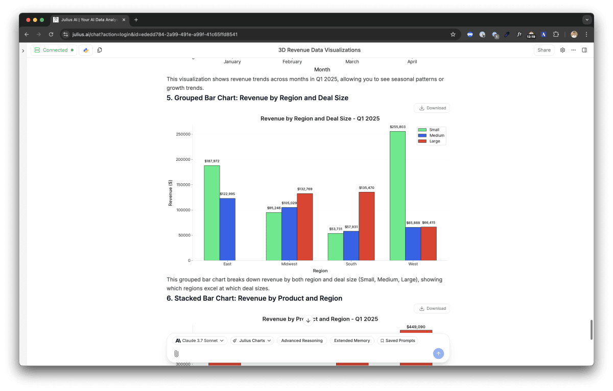
Chart quality is notably good for an AI tool. Julius doesn’t just generate a bar chart and call it done — it labels axes properly, picks sensible color schemes, formats numbers with commas and appropriate decimal places, and chooses chart types that actually communicate the data. A scatter plot when you ask about correlation. A histogram when you ask about distribution. A line chart for trends. This sounds obvious but it’s a real differentiator: most general-purpose AI tools make you specify chart type explicitly, or produce something technically correct but visually clunky.
Julius doesn’t run on a single AI model — it uses a multi-model architecture, routing different tasks to different underlying models. GPT-4o handles much of the code generation work; Claude handles analytical reasoning where methodical step-through matters; model selection can also be done manually on paid plans. The practical effect is that Julius can be better at a specific data task than using any one of these models directly, because the task is being sent to the model best suited for it.
The model-agnostic layer also means Julius isn’t locked to any provider’s limitations. When OpenAI ships an improved model for code tasks, Julius can route to it. When Anthropic improves at statistical reasoning, that gets picked up too. For users, this means the underlying capability improves without any action on their part — no model-switching, no setting changes.
What Julius adds on top of the models is the execution layer: the sandboxed Python and R runtime that actually runs the generated code, the chart rendering engine, the file persistence across the conversation, and the output formatting that turns raw results into something clean. This is the part the raw models can’t replicate out of the box — especially the execution and verification step that confirms the code actually ran correctly before showing you the result.
Notebooks are Julius’s biggest step beyond “chat with your spreadsheet.” A Notebook is a saved sequence of analysis steps — each step is a question Julius answered, preserved with its code and output. You can run the same Notebook on a new dataset later and get the same analysis applied to new data automatically.
The practical use case: monthly reporting. Build your sales analysis once — revenue by region, top products, churn rate, month-over-month delta. Save it as a Notebook. Next month, drop in the new data export and run the Notebook. The entire analysis refreshes in seconds. What used to take an analyst two hours of copy-pasting and reformatting becomes a ten-minute data swap.
Notebooks also matter for teams. A senior analyst builds the Notebook once with the correct methodology — the right statistical approach, the right normalizations, the right chart types. Junior team members or non-technical stakeholders run it by swapping the data. The methodology stays consistent. The senior analyst’s time is spent once, not every month.
Any analysis you run more than once belongs in a Notebook. The time investment is front-loaded — building it takes longer than a one-off query — but every subsequent run is seconds. Monthly reports, weekly dashboards, quarterly performance reviews: all strong Notebook candidates.
Starting point: an exported CSV from Typeform. 700 respondents, NPS score (0-10), free-text comment, plan tier, signup month, country. The question: why are our Enterprise detractors (score 0-6) unhappy when our SMB detractors aren’t mentioning the same things?
Julius ingested the file and immediately flagged 23 rows with null NPS scores — it asked whether to drop them or impute. We dropped them. First question: “Show me NPS score distribution broken down by plan tier.” Julius returned a grouped histogram in 8 seconds. Enterprise users clustered unusually at 3-5. SMB users skewed toward 8-9. Clear split, immediately visible.
Second question: “From the text comments of Enterprise users who scored 6 or below, what are the most common complaint themes?” Julius ran a basic sentiment clustering on the free-text responses — not perfect NLP, but enough to surface that 60% of Enterprise detractors mentioned “onboarding” or “documentation” in some form. SMB detractors most commonly mentioned “pricing.” Entirely different problems requiring entirely different fixes.
Third question: “Show me Enterprise detractor NPS over time by signup cohort — is this a new problem or has it always been there?” Line chart by signup quarter. The onboarding complaints spiked for cohorts that signed up in Q3 2025, which aligned with when we launched a new feature set without updating the onboarding docs. Root cause confirmed.
The starting point every performance marketer knows: four separate ad platform exports, each with different column names, different date formats, different currency handling. Merging them manually in Excel is a 45-minute chore before any analysis begins.
Julius was given all four files in one upload. First question: “Merge these into a single dataset. Standardize the date column to YYYY-MM-DD and normalize spend to USD using last month’s exchange rates.” Julius merged them, flagged that LinkedIn exports spend in CAD and asked for confirmation before converting. Correct call. One click to confirm.
Second question: “Calculate ROAS by channel and by week for the last three months. Show me the trend.” Julius produced a multi-line chart — each channel a different color, weeks on the x-axis, ROAS on the y-axis. Google and Meta steady. TikTok volatile but trending up. LinkedIn consistently below 1.0x — spending more than it returns.
Third question: “If we have a $50,000 budget for next month and want to maximize total ROAS, how should we allocate across channels?” Julius ran a basic optimization — allocate proportionally to recent ROAS performance while maintaining a minimum floor on each channel. Produced a suggested allocation table with the reasoning. Clear, actionable, ready to present.
A public health researcher needed to analyze subgroup effects in a dataset of 200 clinical trial results — outcome scores, patient demographics, treatment arms. No statistician available. Deadline in 48 hours.
Julius was given the Excel file and asked to run a subgroup analysis comparing treatment outcomes by age group and gender. It ran an ANOVA and returned summary statistics per subgroup with p-values. Then the researcher asked: “Are any of these comparisons underpowered given the subgroup sizes?” Julius correctly flagged that the 65+ female subgroup had only 11 patients — results there were statistically unreliable. It added a note to treat those findings with caution. That’s the kind of contextual statistical judgment that distinguishes useful AI analysis from raw number output.
The researcher also asked Julius to generate a methods section describing the statistical approach used. Julius produced a clear paragraph referencing the specific tests run, the significance threshold applied, and the software equivalent (R’s aov() function). Saved significant time in report writing.

We uploaded a 3,200-row e-commerce order CSV and typed this into Julius:
Julius returned results in about 12 seconds:
Correlation analysis:
Pearson r = 0.71 (p = 0.003) — moderate-strong positive
correlation between return rate and avg order value.
Interpretation: higher-ticket items are returned more
frequently, most strongly in Electronics and Clothing.
Clothing returns may reflect fit/sizing issues rather
than value alone — recommend reviewing return reasons
separately for that category.
Three things stand out in that output. First, Julius didn’t just answer the correlation question — it flagged that Clothing’s pattern might have a different explanation than the general trend, and suggested a follow-up analysis. That’s analytical judgment, not just computation. Second, it gave the Pearson r and p-value without being asked — statistically rigorous by default. Third, the output was formatted for reading, not for a console. Ready to paste into a slide.
Julius is accurate on well-structured data and standard statistical operations. In independent testing across business datasets, it handles the routine analytical work — means, medians, correlations, regressions, aggregations, time-series trends — correctly the vast majority of the time. For those tasks, trusting the output is generally reasonable.
Where accuracy becomes genuinely unreliable is complex statistical modeling and forecasting. Ask Julius to build a 3-month revenue forecast using exponential smoothing, or to run a multivariate regression controlling for confounders, and the output can look plausible while being subtly wrong. The model will produce something. It will format it confidently. It may have made assumptions that a statistician would not have made — wrong lag selection, inappropriate model choice for the data’s distribution, failure to check residuals.
Julius will never tell you “I’m not confident in this analysis.” It produces output with consistent formatting regardless of whether the statistical method was correctly applied. For any number you plan to act on — present to leadership, publish, use in a financial decision — verify the methodology using the Show Code feature, or have a domain expert review the approach. The charts look credible whether or not the underlying analysis is correct.
The Show Code feature is your most important verification tool. Every Julius analysis has a “Show code” button that reveals the exact Python or R it ran. If you can read code (even at a basic level), you can verify whether the approach makes sense — whether the date filtering is correct, whether the aggregation is what you intended, whether the statistical test is appropriate for your data type. If you can’t read code, find someone who can for any high-stakes analysis.
The practical habit that works: treat Julius analysis as a first draft. It’s extremely fast and usually directionally correct. Use it to find the interesting patterns, identify the right questions, and build the structure of your analysis. Then verify the numbers that matter before they leave your desk.
a/julius b/chatgpt-data-analysis
ChatGPT’s Advanced Data Analysis (the former Code Interpreter) is the most direct comparison point. Both let you upload data and analyze it via chat. Both run Python under the hood. The differences are sharper than they appear at first.
Verdict: If data analysis is your primary use case, Julius is the better tool — persistence, connectors, and Notebooks alone justify the difference. If you already pay for ChatGPT Plus and only occasionally analyze data, the built-in mode is sufficient. Don’t subscribe to Julius for casual use.
Honest tool reviews include the failure modes. Julius has several worth knowing before you commit.
Ask for anything beyond standard descriptive or inferential statistics — time-series decomposition, survival analysis, Bayesian inference, custom ML models — and Julius becomes unreliable. It will attempt these tasks. It will return output that looks reasonable. But the methodology may be wrong in ways that aren’t visible without domain expertise. This isn’t unique to Julius — it’s a fundamental limitation of AI-generated statistical code — but Julius’s confident formatting makes it easy to miss.
Fifteen messages per month. A single focused analysis session can burn through that in one sitting. If you’re evaluating Julius seriously, start with a Plus trial — the free plan will give you a false impression of what the tool is actually like when you have room to iterate. The 15-message limit gates the iterative loop that makes Julius valuable.
Files with hundreds of thousands of rows can overwhelm Julius’s analysis context. It will process them — Julius has high RAM allocations on Pro and above — but very complex multi-join analyses on large datasets can produce slower responses and occasionally lose intermediate context. For genuinely large-scale data work, Julius is better for exploratory analysis than for production queries against millions of rows.
The default charts are good. Making them exactly right for a publication-quality slide is harder. You can ask Julius to change colors, adjust axis ranges, and modify titles — it will try. But fine-grained aesthetic control (specific hex colors, custom fonts, precise legend placement) is frustrating. For polished charts, use Julius to produce the analysis and a dedicated tool like Flourish or Datawrapper for final presentation.
There’s no team-friendly middle tier between Pro at $45/user and Business at $375/month. A three-person team that wants shared workspaces has to jump from three Pro accounts ($135/mo) to Business ($375/mo) — nearly 3x the price. This is the most common complaint from teams evaluating Julius at the growth stage.
Julius works best in a specific profile. Understanding whether you fit that profile is more useful than any feature list.
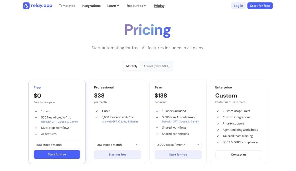
Julius’s pricing structure (as of mid-2026) has more tiers than most tools in this category. Here’s what each one actually means in practice:
Free — 15 messages/month. Enough to understand what Julius does, not enough to use it productively. Treat it as a demo, not a working tier.
Plus at $35/month — 250 messages/month, file uploads, 16GB RAM processing. The right entry point for individual users who analyze data a few times a week. 250 messages is roughly 8-10 focused analysis sessions per month — enough for a weekly reporting workflow. Annual billing brings it to about $29/month.
Pro at $45/month — unlimited messages, live database connectors (Postgres, Snowflake, BigQuery, Google Ads), Notebooks. The right tier for anyone who uses Julius daily or needs to connect directly to a database instead of uploading files. The unlimited messages change the experience — you stop rationing questions and start iterating freely. Annual billing drops it to about $37/month.
Max at $200/month — the largest context window and highest RAM allocation. For teams analyzing genuinely massive datasets or running complex multi-step analyses where context length matters. A niche tier; most users won’t need it.
Business at $375/month — team workspaces, shared analyses, Slack integration, custom agents, centralized billing. Designed for teams rather than individuals. The price jump from Pro is steep; it makes most sense for teams of five or more where collaboration and shared workflows justify the cost.
Julius offers 50% off all plans for students and educators. For academic researchers and students, Pro at $22.50/month is one of the better data tool deals available. Worth noting if that profile applies.
Before your first analysis question, ask: “Describe this dataset — what are the columns, data types, any missing values or anomalies?” This upfront audit shapes every question that follows and surfaces data quality issues before they corrupt your results.
Every output has a “Show code” button. Read the Python Julius ran. Even if you can’t write code, you’ll start to understand the logic — what filtering it applied, how it grouped data. Over time this makes you better at asking questions and better at catching errors.
Julius knows your column names and data types but not your business context. Tell it: “This is a SaaS churn dataset. ‘Event: canceled’ means the customer churned. ‘MRR’ is monthly recurring revenue in USD.” Better context produces more accurate interpretations and more relevant follow-up suggestions.
Don’t write one mega-question: “Analyze everything about my data and produce a full report.” Break it into sequential questions. Each answer informs the next. You’ll get better results, use fewer messages, and be able to catch issues before they cascade.
When Julius runs an analysis you’ll want to repeat, save it as a Notebook before the session ends. It takes one click. Forgetting to save and trying to recreate the same analysis from scratch next month is how time gets wasted.
On Pro and above, direct database connectors replace the upload-export-reupload cycle entirely. Connect Julius to your Postgres or BigQuery instance once, and query live data. No stale exports, no version mismatch between what’s in the database and what Julius is analyzing.
The honest summary: there’s no tool that does exactly what Julius does at a lower price point in 2026. ChatGPT’s data mode comes closest but lacks the workflow infrastructure. If structured data analysis is your core use case, Julius is the purpose-built option. If it’s occasional, a ChatGPT Plus subscription covers the same ground adequately.
For dedicated data work, yes. Julius has persistent sessions (your data stays in context between questions), larger file handling, direct database connectors, and Notebooks for recurring workflows. ChatGPT’s Advanced Data Analysis mode does similar things but it’s a feature within a general chatbot, not a purpose-built tool. If data analysis is your primary use case, Julius is the stronger choice.
Yes, on Pro and above. Julius supports direct connections to PostgreSQL, Snowflake, BigQuery, and Google Ads. You connect once and query live data — no CSV export required. Business plan also adds Slack integration and shared workspace connectors.
Yes — every analysis output includes a “Show code” button that reveals the exact Python, R, or SQL Julius ran. This is your most important verification tool. Check it for any analysis you plan to act on seriously.
Very good for standard analytical operations — means, medians, correlations, regressions, groupings, time-series trends. Less reliable for complex statistical modeling and forecasting, where it can produce plausible-looking but methodologically flawed results. Always sanity-check high-stakes analysis using the Show Code feature.
CSV, Excel (.xlsx and .xls), JSON, TXT, PDF, images (PNG, JPG), Python scripts, R scripts, and Jupyter notebooks. For structured data analysis, CSV and Excel are the best-supported formats.
Yes, but it’s severely limited at 15 messages per month. That’s enough to evaluate the tool but not enough to use it productively. A single focused analysis session can consume all 15 messages. Start with Plus if you’re seriously evaluating it.
For exploratory analysis, absolutely. Julius handles survey data, experimental datasets, and literature review tables well. For publishable statistical analysis, it works best as a drafting tool — use Julius to run and visualize the analysis, then verify the methodology with a statistician or by checking the generated code against your domain’s standards.
Julius uses a multi-model architecture — GPT-4o, Claude, and other models are routed based on the task type. On paid plans you can also manually select your preferred model. The platform handles model routing transparently; you don’t need to think about it for most analyses.
Yes — that’s the primary design goal. You ask questions in plain English. Julius handles the code. You get charts and numbers back. The learning curve is mostly about knowing what questions to ask and how to iterate, not about any technical knowledge. The free plan’s 15-message limit is actually the biggest barrier to learning, not the interface.
It will attempt forecasting and sometimes does it well for simple trend extrapolation. For genuine time-series forecasting (ARIMA, Prophet, exponential smoothing) the results are unreliable — Julius may use the wrong model or wrong parameters without flagging it. Treat any Julius forecast as directional, not authoritative.
Julius does one thing extremely well: it takes the barrier between non-technical people and their data and removes it. Upload a spreadsheet, ask a question, get an answer with a chart. That sounds simple because it is. The depth comes in the iteration — follow-up questions, Notebooks for repeatable workflows, database connectors for live data — and in the execution layer that actually runs the code rather than just generating it.
The caveats are real. The free plan is impractical. The Plus-to-Business pricing gap is awkward. And complex statistical modeling is not reliable enough to trust without verification. But for the everyday data questions that most non-technical teams actually have — what’s our best-performing channel, where are we losing users, what does our cohort retention look like — Julius gets there faster and more accessibly than any alternative. At $35-45 per month, it’s significantly cheaper than even a few hours of analyst time. For founders, marketers, and researchers who live in this space: it’s worth the free trial.
Every verified price, limit, and model change we have tracked for Julius AI.
One email when Julius AI changes price or limits. No account, no spam.