AI Tool

Napkin AI
Napkin AI
Napkin AI
Turns any text into polished diagrams and infographics in seconds — no design skills required.
Turns any text into polished diagrams and infographics in seconds — no design skills required.
Napkin AI is a browser-based tool with a single core premise: your writing already contains the structure for a diagram — you just can’t see it yet. Paste a paragraph explaining your onboarding funnel, a bulleted strategy memo, a process description, or a comparison of two options, and Napkin’s AI reads the logical structure embedded in your text and renders it as a visual — a flowchart, a mind map, a timeline, a comparison table — in a few seconds.
The company was founded in 2023, raised $10 million from Accel and CRV, and launched publicly in 2024 after an extended free beta. The beta ran long enough that Napkin accumulated over 5 million registered users before the paid tier even launched — which is either a sign of genuine product-market fit or an extremely long runway. Probably both. By 2026, with proper pricing in place (Free, Plus at $9/mo, Pro at $22/mo), it’s solidified from “cool beta toy” into a legitimate productivity tool.
The positioning sits deliberately between two tool categories that both fail at this job. On one side: diagramming tools like Lucidchart, Miro, or draw.io — powerful but blank-canvas, requiring you to drag shapes and wire connections manually. On the other: presentation tools like PowerPoint or Google Slides — familiar but hopeless for structured diagrams. Napkin skips both: it reads what you’ve already written and produces the visual for you. The diagram is the output, not the starting point.
What Napkin is not: it is not a full design tool, not a data visualization layer (no spreadsheet connections, no live data), and not a presentation builder with layouts and speaker notes. It is a focused, narrow tool that does exactly one thing with unusual competence — and that’s the right call.
The core interaction is this: you open a Napkin document, paste your text (or type directly), highlight a section, and click the “Napkinify” button. That’s it. The AI analyzes your content, decides what type of visual fits the logical structure, and generates two or three visual options within a few seconds. You pick the one you want, make edits, and export.
Here’s what that looks like on a real piece of writing. Take this paragraph:
Napkin reads that and generates three visual options in under five seconds — typically a horizontal three-stage flowchart, a vertical funnel diagram, and a labeled comparison card. All three are accurate representations of the written content. The flowchart is usually the most useful. You select it, and you’re editing from there.
// 3 style variants offered: horizontal / vertical / card
// editable: labels, colors, icons, font, layout direction
The thing that makes this feel genuinely different from older diagram tools is that the structure comes from the prose, not from your manual arrangement. You didn’t tell Napkin “make a three-node flowchart.” Napkin inferred the nodes, the directionality, and the labels from the writing. When your text is clear, the output is usually right on the first or second option. When your writing is ambiguous or dense, the output reflects that ambiguity — which is itself useful feedback about your own writing.
Think of it not as “draw a diagram” but as “make the structure of my writing visible.” The better your writing explains relationships and sequences, the better the visual. If Napkin generates a muddled diagram, the likely fix is clarifying the writing — which is often the right fix anyway.
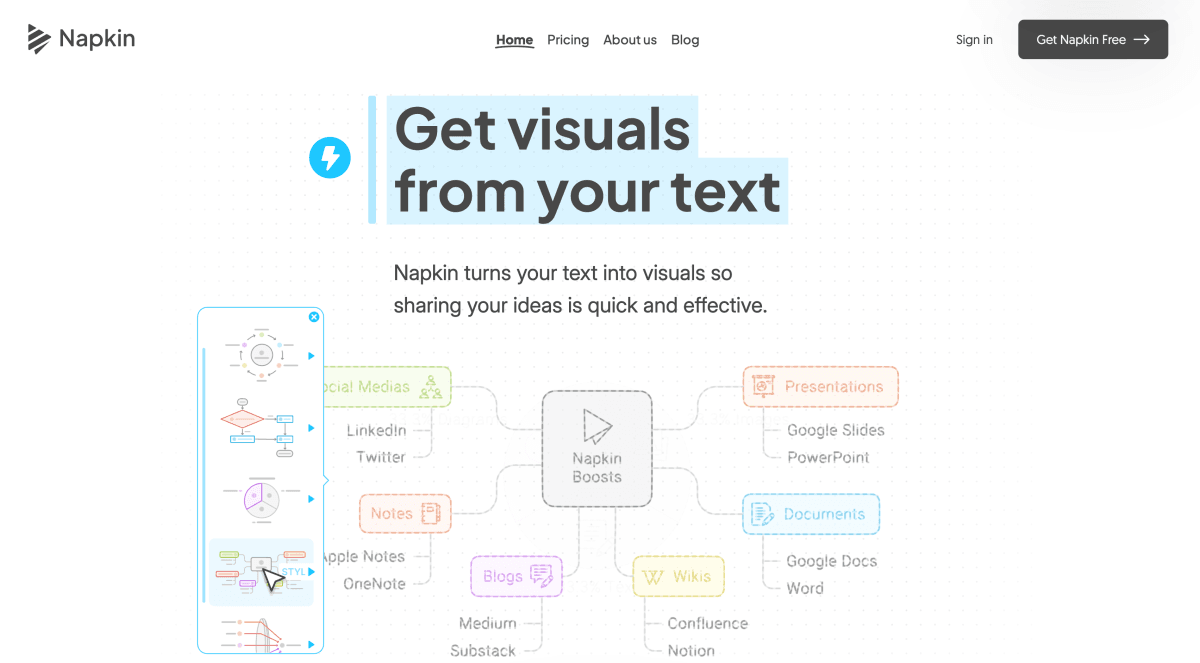
Napkin generates six main categories of visual, and the AI picks between them based on what your text is actually saying:
The default and most common output. Any text that describes a sequence of steps, a decision tree, or a process with multiple stages gets rendered as a flowchart. Works well for onboarding flows, technical architectures described in prose, sales processes, and how-to sequences.
For text that describes a central idea with radiating sub-points — introductory overviews, brainstorm summaries, conceptual explanations. Napkin renders a hub-and-spoke layout with the central concept in the middle and branches fanning out. The depth (two levels, three levels) is inferred from how nested your text is.
Two-column or multi-column layouts for text that explicitly contrasts options. “Option A does X, Option B does Y” reliably produces a side-by-side table or a split-panel card. Useful for competitive analyses, feature comparisons, decision summaries.
For text with temporal structure — “in Q1 we did X, in Q2 we launched Y.” Napkin produces horizontal or vertical timeline visuals with dated nodes. The date parsing is imprecise but adequate for illustrative timelines rather than Gantt-style project management.
Top-down tree structures for text that describes reporting relationships, category hierarchies, or nested taxonomies. Not as strong as dedicated org chart tools but capable for light use.
For text that highlights a single key number or fact — “our NPS is 72, up from 54 last year” — Napkin generates a bold stat card suitable for blog embeds, LinkedIn posts, or slide callouts. Simple but high-impact when you want to make a number stand out.
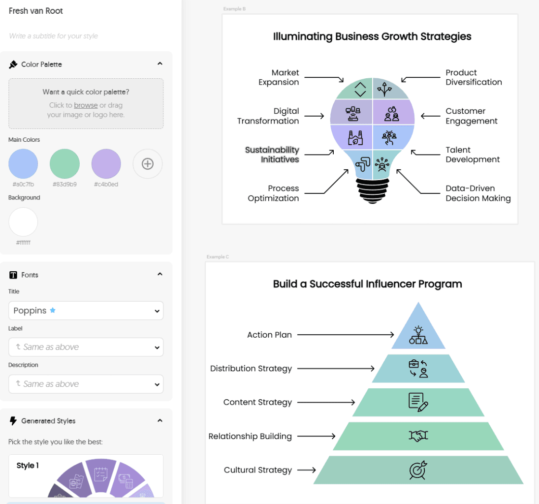
After generation, you’re not stuck with what the AI produced. Napkin’s editor lets you change text labels, swap icon styles, adjust colors, toggle layout direction (horizontal, vertical, square), and apply brand styles. The editing surface is point-and-click — click a label to edit it, click a color swatch to change it. No drag-and-drop canvas complexity.
The free plan gives you standard icons and Napkin’s default color palette. Plus and Pro unlock custom brand colors and fonts. Pro adds exclusive design templates, font uploads (so your diagrams match your brand typography), and unlimited custom style profiles — the feature set that matters for agencies and content teams producing at volume.
There are 700+ Google Fonts available on paid plans, and the style system is solid for what it is. You can define a brand style once — colors, fonts, icon set, corner radius — and all subsequent generated visuals apply it automatically. For a consultant producing visuals for multiple client decks, this is the time-saving feature that justifies the Pro price.
On Plus or Pro, spend five minutes configuring a brand style with your colors and preferred font before generating anything. Every visual you produce will look cohesive from the start. Retrofitting brand styles to 20 already-generated diagrams is slower than getting it right upfront.
What editing cannot do: you can’t fundamentally restructure a diagram. If Napkin generated a three-node flowchart and you want a five-node one with a different branching structure, you’re better off editing your source text and regenerating than trying to add nodes manually. The editing layer polishes; it doesn’t rebuild. This is the right design choice for a generation-first tool, but it means Napkin is not a replacement for a blank-canvas diagramming tool when you need full structural control.
Export options cover the main professional formats:
The PPTX export is underrated. Most AI visual tools produce flat image exports that you paste as rasters into PowerPoint — then you can’t touch them. Napkin’s PPTX output is a real editable object. For consultants and executives who submit deliverables as PowerPoint files and need the diagrams to be editable by clients, this matters more than it looks on a feature list.
Sharing also works via direct link — a Napkin document URL shows your text and generated visuals together, formatted as a clean page. Useful for sharing a document-as-visual artifact without exporting at all.
A consultant has finished writing a strategy memo for a client. The memo has a clear structure: situation, options, recommendation, roadmap, risks. The client wants a PowerPoint deck. The usual path: spend 90 minutes rebuilding the structure from scratch in PowerPoint, dragging shapes, aligning boxes, agonizing over whether “SmartArt” will embarrass them.
The Napkin path: paste the situation section into Napkin, Napkinify. Get a clean two-node comparison (current state vs. future state). Paste the options section. Get a three-column comparison card. Paste the roadmap. Get a four-stage timeline. Each one takes about 90 seconds of editing to finalize: tweak labels, apply brand colors, adjust layout direction. Export all six as PPTX.
The exported slides drop into the final deck as native PowerPoint objects. The client can edit them after delivery. Total visual production time: under 25 minutes. Without Napkin: 90 minutes of frustrated drag-and-drop, often resulting in visuals that look worse anyway.
A lecturer is writing notes on the software development lifecycle. The text already contains clear structure: phases, dependencies, decision points, feedback loops. In the past, they’d either embed a generic SDLC image from Google Images (looks generic, might be wrong for their version of the concept) or build one in PowerPoint (time-consuming, often ugly).
Pasting the relevant paragraph into Napkin and Napkinifying produces a clean circular lifecycle diagram with labeled phases that matches the specific content of the lecture. The lecturer edits two label names to match their preferred terminology, applies a color scheme that works on projector screens, and exports as PNG for slides and PDF for handouts. Four minutes total.
The deeper value: every concept in the course that benefits from a visual can get one, without the friction that normally means most concepts stay text-only. Napkin removes the “is this worth the time to visualize?” calculation. It’s always worth it because it takes four minutes.
A founder is writing a LinkedIn post about their go-to-market strategy. The post has a clear section explaining a three-step acquisition model. The post would benefit from a visual that makes the three steps concrete, but pausing to open Figma and build a graphic would kill the writing flow — and take 30 minutes for something that appears in a social media feed for three seconds.
Paste the three-step section into Napkin, Napkinify, select the horizontal flowchart option, tweak one color, export PNG. The whole detour is under three minutes and doesn’t break the writing session. The visual gets uploaded to LinkedIn with the post. Engagement on posts with clear visuals typically outperforms text-only posts — which the founder knows, which is why they wanted one, which is why the friction of making one used to mean they skipped it.
a/napkin-ai b/powerpoint-figma
The main competition for Napkin isn’t other AI tools — it’s the tools people already have and use poorly for this specific job: SmartArt in PowerPoint and manual diagramming in Figma. Both can produce the same visuals Napkin generates. Neither does it in three minutes from prose.
Verdict: For explainer visuals — diagrams, flowcharts, timelines, comparisons — Napkin is dramatically faster. For bespoke layouts, brand-heavy compositions, or anything requiring pixel precision, PowerPoint or Figma is still the right tool. Many users end up using Napkin to generate the first draft and PowerPoint to make final adjustments.
Napkin earns its score, but knowing the ceilings before you commit avoids the frustration of discovering them mid-project.
If you want to add a node, change branching logic, or restructure the layout in a meaningful way, the fastest path is almost always: edit the source text, regenerate. Napkin’s editor handles label edits and style changes well. It handles structural changes poorly. You cannot drag a node to a new position in the hierarchy or rewire a connection. If the AI inferred a three-stage sequence but you need five stages, go back to the text.
Napkin works on text. It has no ability to pull from a Google Sheet, a database, or an API. If your visual needs to reflect real numbers that change over time — a revenue chart, a live dashboard visual — Napkin is not the tool. This is a clear positioning choice, not a bug, but it’s worth stating plainly.
Dense, ambiguous, or poorly structured prose produces dense, ambiguous, or poorly structured diagrams. The AI is not correcting your thinking — it’s rendering it. A paragraph that buries the point produces a visual that buries the point. This is honest behavior, but it means non-writers find the tool harder to use than writers do.
There are no custom shapes, no freehand drawing tools, no multi-page layouts, no master templates, and no real-time collaboration in the full-fledged sense that Figma provides. Napkin’s icon library is large and its style system is capable, but if a client asks for “something that looks like our brand guidelines exactly,” you may need to take the PPTX export into PowerPoint for final finishing.
All exports on the free plan include Napkin AI branding. For any professional context — client deliverables, published blog posts, LinkedIn posts — the watermark will look unprofessional. The Plus plan at $9/mo removes it. If you’re using this for work, the free plan is for evaluation only; $9/mo is the real entry price.
There are no native plugins for Google Docs, Notion, Confluence, or WordPress. You copy-paste text into Napkin and export visuals out. The lack of integrations adds a small amount of friction that dedicated content teams will notice over hundreds of uses. Napkin’s roadmap hints at integrations, but as of mid-2026 it’s manual copy-paste.
The free plan — 500 AI credits per week, unlimited editing, PNG and PDF export — is genuinely useful for evaluation. You’ll hit the credit limit if you’re generating and regenerating in a productive session, but for occasional use it works. The watermark on exports is the real limiter; treat it as a demo tier.
Plus at $9/month ($6.75/mo annual) is the plan to start with for any professional use. It removes the watermark, enables SVG and PPTX export, gives you 3 brand styles, and raises AI credits to 10,000/month — which is enough for steady, daily use by a single person. This is the right plan for most individuals.
Pro at $22/month ($16.50/mo annual) is for power users and teams. 30,000 monthly credits, unlimited custom brand styles, font uploads, exclusive design templates, and optional credit top-ups if you burn through the quota. If you’re producing visuals at volume — for multiple clients, for a content publishing operation, for an in-house design system — Pro is worth the step up.
bench –tool=napkin –metric=value-per-dollar comparable tools
The math is straightforward for most use cases. If Napkin saves a consultant 60 minutes of design work per week, the $22/mo Pro plan pays for itself in under 30 minutes of a single billing month. The question is whether diagram-making is actually a friction point in your workflow. If it is, Napkin is cheap. If you rarely produce diagrams, the free plan covers your needs indefinitely.
Yes, genuinely free — 500 AI credits per week with no time limit, PNG and PDF export included. The free plan includes a Napkin branding watermark on exports. For professional use, Plus at $9/mo removes the watermark and adds SVG and PPTX export. Evaluate free, upgrade when you want to use it for real work.
Flowcharts, process diagrams, mind maps, concept maps, comparison visuals, timelines, hierarchy charts, and stat callout cards. The AI picks the most appropriate type based on your text’s logical structure. You can guide it by specifying a preferred type, and you can switch between the generated options before selecting one.
Yes. Plus allows 3 brand styles (colors, fonts, icon sets) and Pro allows unlimited custom styles with font uploads. Define a brand style per client and every generated visual automatically uses those colors and fonts. Useful for agencies managing multiple client identities.
Passably, not brilliantly. Napkin can generate basic technical flow diagrams from prose descriptions, but if you need proper UML notation, database schema visuals, or cloud architecture diagrams with precise component icons, dedicated tools like draw.io, Miro, or Lucidchart will serve you better. Napkin’s sweet spot is business and communication visuals, not technical specification diagrams.
Yes, within limits. You can edit text labels, change colors, swap icons, adjust layout direction, and apply different style profiles. You cannot fundamentally restructure the diagram — add new nodes, change branching logic, or rewire connections. For structural changes, the faster path is to edit your source text and regenerate.
PNG and PDF are available on the free plan (with branding). SVG (scalable vector, useful for Figma and web) and PPTX (editable PowerPoint object) require Plus or Pro. The PPTX export is particularly useful — it produces a native editable slide element, not a flat image, so clients and colleagues can adjust it post-delivery.
Not natively as of mid-2026. The workflow is manual copy-paste: copy text from your doc into Napkin, generate the visual, export and embed back in your doc. It’s a two-minute detour, not a seamless integration. Native plugins have been requested and hinted at by the Napkin team but aren’t available yet.
Very much so. The free plan’s PNG export is enough for embedded blog visuals if you’re OK with the branding. Plus removes the branding for $9/mo, which is typically worth it if visual content is part of your publishing workflow. The low friction — minutes from paragraph to visual — makes it practical to add a diagram to every post that benefits from one, rather than only the posts where the effort feels worth it.
Napkin handles multiple languages including Spanish, French, German, and Portuguese with reasonable output quality. Less common languages and complex scripts (Arabic, CJK) work with varying reliability. For non-English content creation, test your specific language on the free plan before committing to a paid tier.
Napkin AI earns its score not by doing many things but by doing one thing better than anything else available. If your workflow regularly requires turning written content into shareable diagrams — for decks, for posts, for educational materials, for client deliverables — Napkin eliminates the most painful part of that workflow. The prose-to-visual inference is genuinely accurate, the export options are professional-grade (especially PPTX), and the pricing is among the most accessible in the AI tools space.
The score isn’t higher because Napkin is a narrow tool. It cannot replace a full design platform, cannot connect to live data, and cannot structurally rearrange its own output. These aren’t failures — they’re the natural limits of a focused product. The 8.0 is a high score for a tool that’s clearly defined its job and executes it well, not a knock for the things it doesn’t try to do.
Free plan for a week. You’ll know by Thursday whether you need Plus.
Every verified price, limit, and model change we have tracked for Napkin AI.
One email when Napkin AI changes price or limits. No account, no spam.